Data intelligence / Energy infrastructure
Queue Intel OS
A cleaner way to read ISO interconnection queue pressure.
A prototype that ingests public ISO queue files, normalizes projects, tracks movement, and ranks where developers would enter behind the most queued capacity.
Status
Prototype
Timeline
Built as a focused market wedge
Domain
Energy infrastructure
Why
Data intelligence
Stack
Languages, services, data sources, and operating pieces behind the build.
Code Proof
What The Build Actually Contains
Sources
ISO files
Pipeline
Python
Model
Queue events
Surface
Risk table
Product proof
Implementation
Code Behind The Surface
Normalize the messy queue files
pyThe first job was making different ISO exports behave like one product model.
FIELD_ALIASES = {
    "queue_id": ["Queue ID", "Queue Number", "project_number"],
    "sponsor": ["Interconnecting Entity", "Interconnecting Customer", "developer"],
    "mw": ["Capacity (MW)", "Project Size (MW)", "Requested MW", "Queue MW"],
    "poi_name": ["POI", "Point of Interconnection", "Interconnection Location"],
}

def normalize_row(iso: IsoCode, row: dict[str, Any]) -> QueueProject:
    normalized = {field: _first(row, aliases) for field, aliases in FIELD_ALIASES.items()}
    queue_id = str(normalized.get("queue_id") or _hash(row)[:12])

    return QueueProject(
        project_id=f"{iso.value}:{queue_id}",
        iso=iso,
        queue_id=queue_id,
        sponsor=_clean(normalized.get("sponsor")),
        mw=_float(normalized.get("mw")),
        poi_name=_clean(normalized.get("poi_name")),
        raw_row_hash=_hash(row),
    )
Find what changed
pyA static queue is useful. A moving queue is where the signal lives: new projects, withdrawals, and capacity changes.
def detect_events(previous: list[QueueProject], current: list[QueueProject]) -> list[QueueEvent]:
    previous_by_id = {project.project_id: project for project in previous}
    current_by_id = {project.project_id: project for project in current}
    events: list[QueueEvent] = []

    for project_id, project in current_by_id.items():
        old = previous_by_id.get(project_id)
        if old is None:
            events.append(_event(EventType.NEW_PROJECT, project, "Not present", project.status, "..."))
            continue

        if (old.status or "").lower() != (project.status or "").lower():
            event_type = EventType.WITHDRAWAL if "withdraw" in (project.status or "").lower() else EventType.STATUS_CHANGE
            events.append(_event(event_type, project, old.status, project.status, "..."))

        if old.mw != project.mw:
            events.append(_event(EventType.MW_CHANGE, project, f"{old.mw} MW", f"{project.mw} MW", "..."))

    return _dedupe_events(events)
Rank cluster pressure
tsThe UI ranks crowded POIs, sponsor concentration, churn, and queue-ahead pressure.
return applyPressureRanks(rows.map((row) => computeClusterRisk(mapRiskInput(row))))
  .filter((risk) => isMeaningfulText(risk.clusterName))
  .sort(
    (a, b) =>
      b.riskScore - a.riskScore ||
      (a.pressureRank ?? 100) - (b.pressureRank ?? 100) ||
      (b.queueAheadMw ?? 0) - (a.queueAheadMw ?? 0)
  )
  .slice(0, 50);

function pressureMetric(risk: ReturnType<typeof computeClusterRisk>) {
  if (risk.queueAheadMw && risk.queueAheadMw > 0) {
    return risk.queueAheadMw * 10 + risk.activeProjectCount;
  }
  return risk.activeProjectCount;
}
Project Logic
Why This Exists
The useful part is the path: what was broken, what I built, and where the leverage showed up.
Mission
Can public interconnection queues become a usable decision layer?
Interconnection queues are public, but hard to use. Developers, investors, and analysts need to see capacity pressure, project movement, and crowded entry points.
Build
What Had To Work
I built a prototype that normalizes queue records, tracks movement across updates, and surfaces where a developer would enter behind the most queued capacity.
Why It Matters
PJM / MISO / ERCOT
Turns ISO queue noise into a go/no-go market-entry view for developers and investors.
Hard Parts
Public data needs product shape
Different ISOs publish different shapes, labels, and update rhythms. The constraint is making the data comparable without pretending it is cleaner than it is.
Rows are cheap. Judgment is the product.
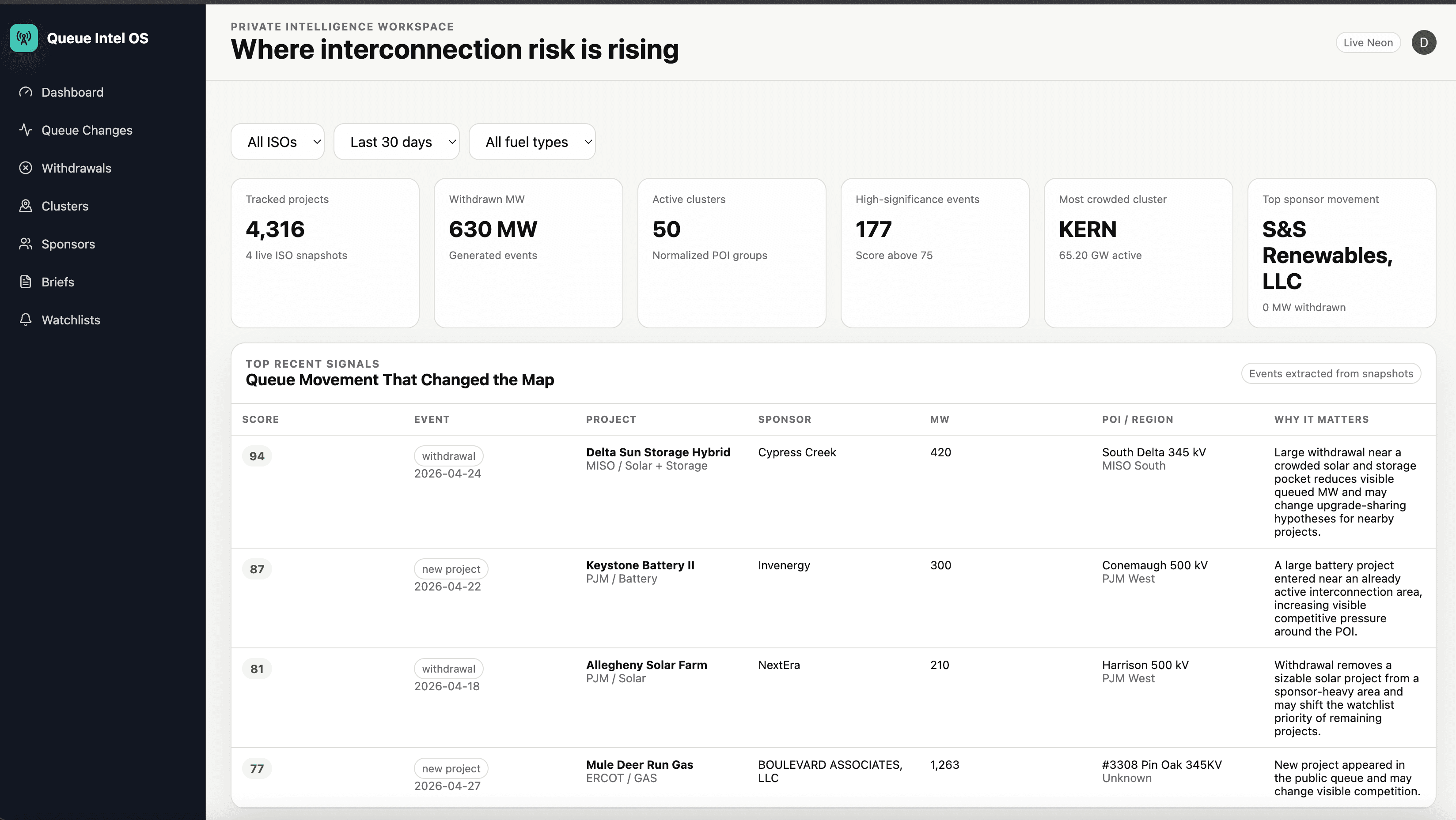
A table of 4,000 projects becomes useful when the interface flags important movement, crowded clusters, and sponsor changes.
The UI had to feel like an analyst
The dashboard leads with filters, risk metrics, recent signals, and a clear explanation of why each event matters. That is the difference between data access and decision support.
Decisions
Proof
Prototype artifact with inspectable product surface, implementation details, and proof points.
Sources: ISO files
Pipeline: Python
Model: Queue events
ISO queue file ingestion
Project normalization
Queue movement tracking
Tell Me About Your Project
Bring Me The Bottleneck.
I’ll Build The Answer.
Tell me what people are trying to do, where the current path breaks, and what kind of useful answer should exist.
Market Gap
Demand exists, but the answer is missing.
Workflow Drag
The work is still too manual, slow, or scattered.
Product Wedge
A small surface could prove the larger opportunity.